Cairns Adventure Group experienced rapid growth by acquiring multiple brands, becoming FNQ’s fastest-growing business by 2023. As a result, branding fell behind amid major business decisions. Here, I’ll show how I’ve transformed the visual identity—bringing consistency, style, and a strong, unified brand presence.
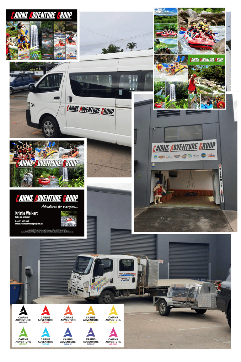
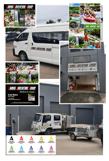
As seen below, before the rebrand Cairns Adventure Group used the logo in every possible colour, with no defined palette, style, or consistency. The branding lacked unity and professionalism—undermining trust despite being FNQ’s fastest-growing business. That ultimately resulted in confusion to the outside world and especially to potential customers.
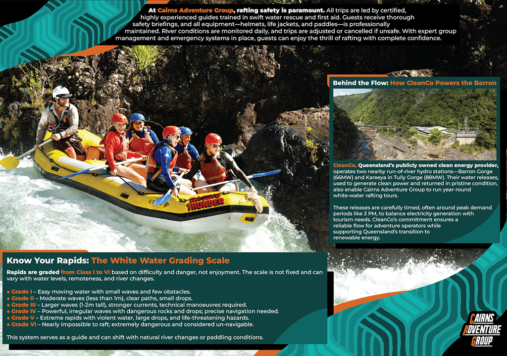
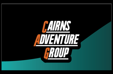
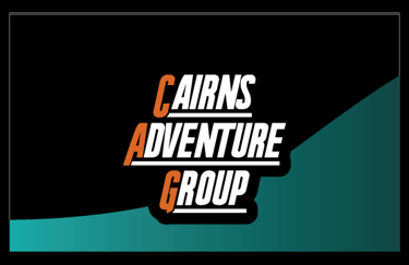
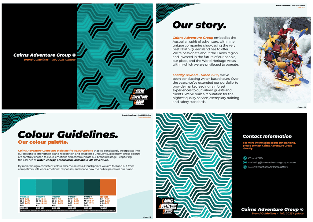
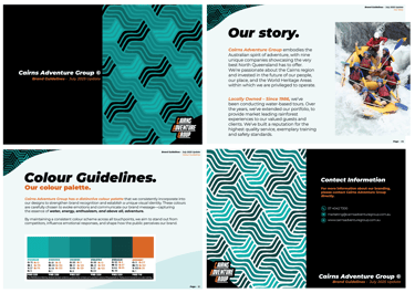
Let’s pause and take a moment to explore the refreshed visual identity of the brand:
The new look gives Cairns Adventure Group a bold, cohesive identity. With consistent visuals and a defined style, the brand now feels professional, trustworthy, and ready for wider recognition.
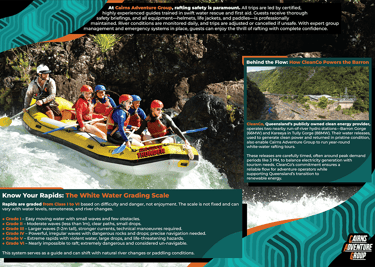
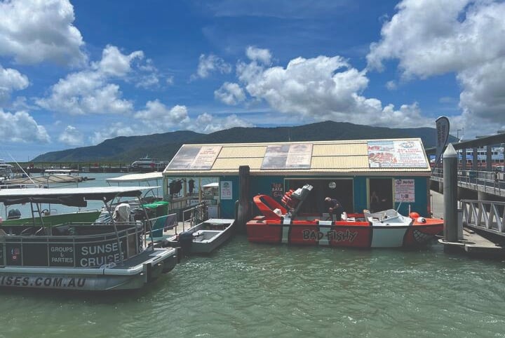
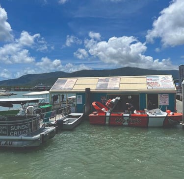
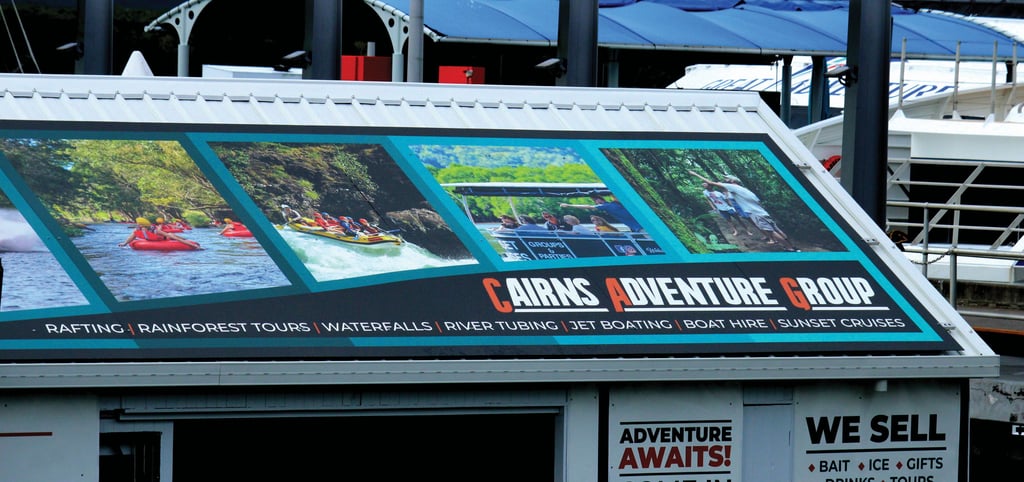
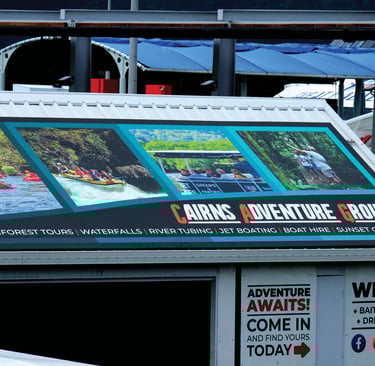
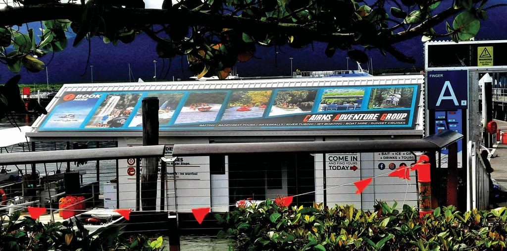
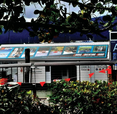
Finally, here’s a look at the new 12-meter sign at the Marine Depot in Cairns Marlin Marina. Once neglected and off-brand, it now proudly reflects Cairns Adventure Group’s identity and professionalism—even from hundreds of meters away. Before and after comparison shots:
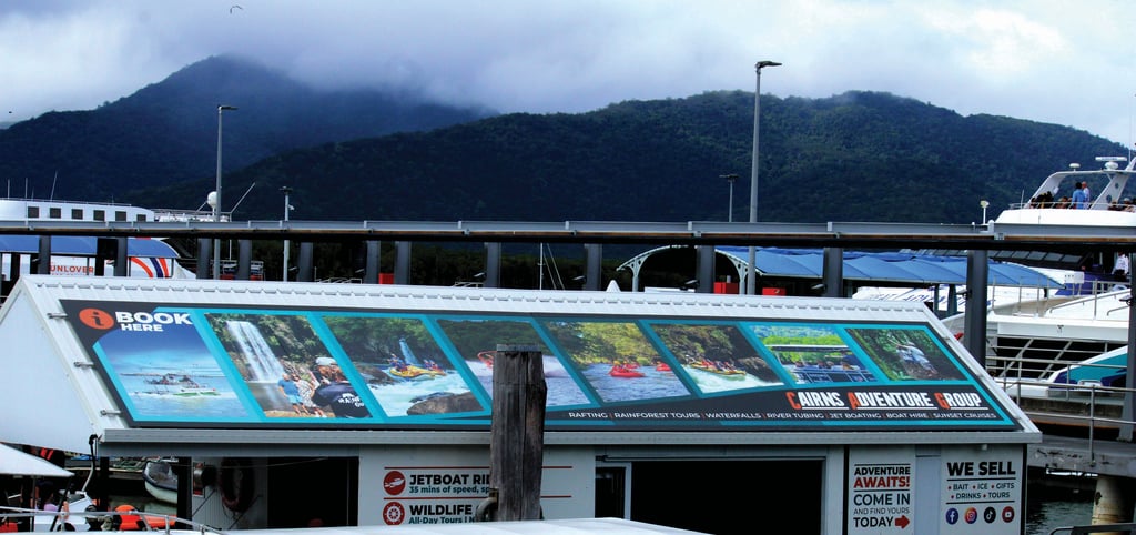
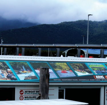
Before:
Now:
Want to elevate your brand with the same clarity and impact? Let’s work together.
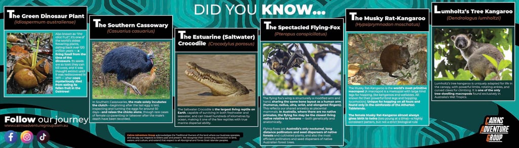
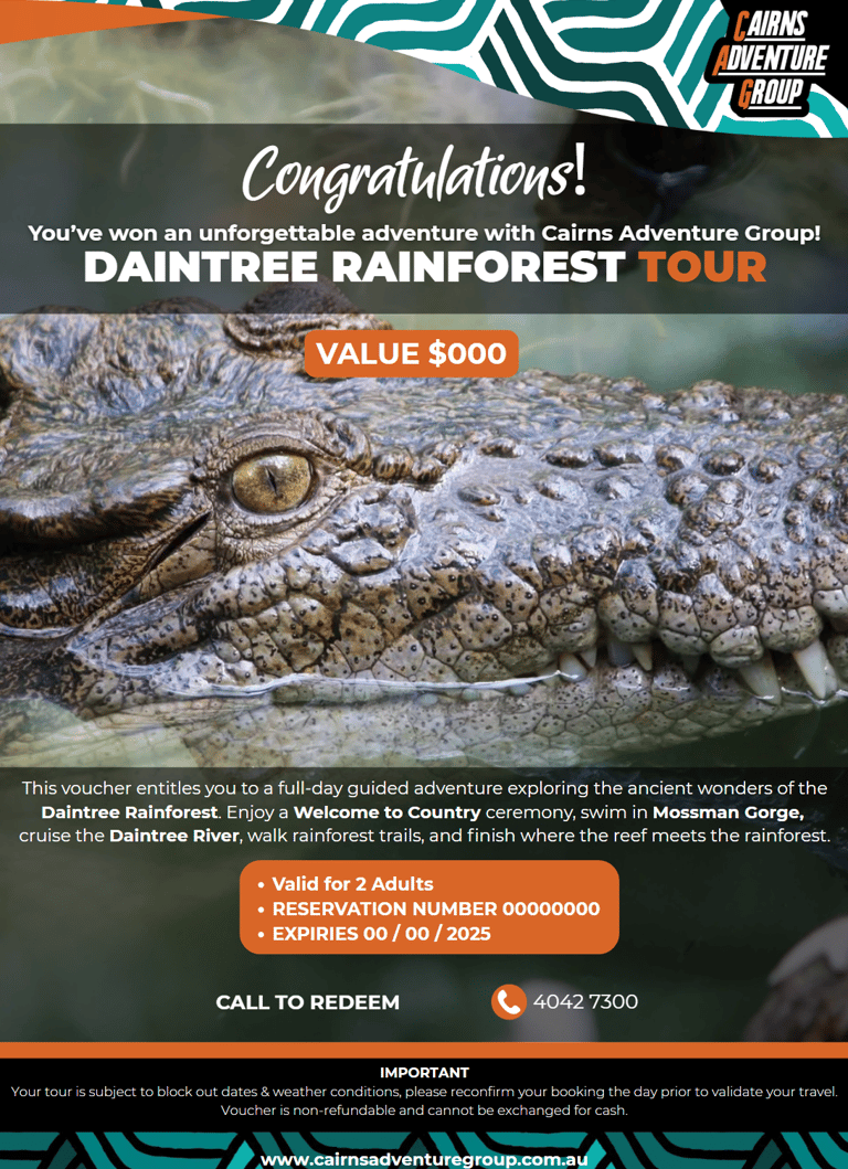
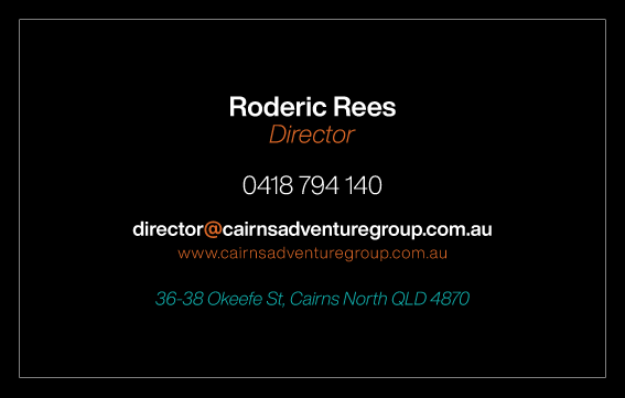
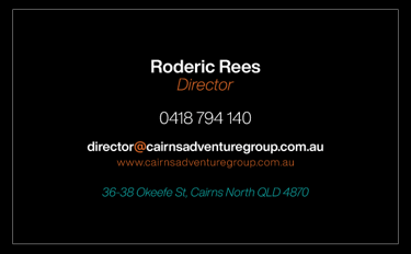
Colour consistency, visual clarity, and graphic unity. All working together to deliver a strong, on-brand presence to the world. The first step: Creating a comprehensive style guide to ensure consistent and effective brand usage
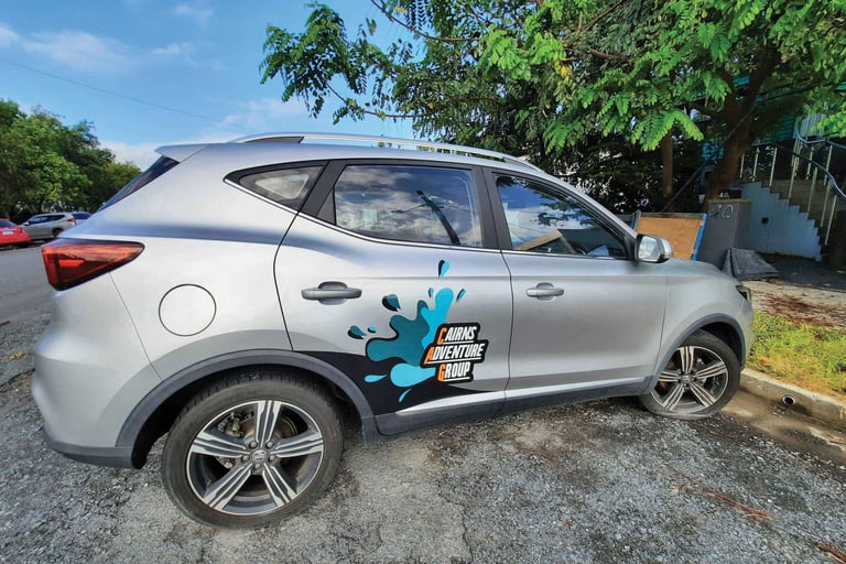
Before = All over the place!
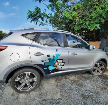
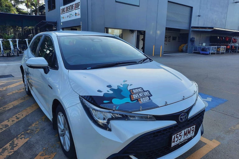
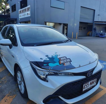
Now = Consistency | Clarity | Quality | Functionality | Style: